Color Psychology in Branding: Which Color Sells?
Color Psychology in Branding: Which Color Sells?
Colors are far more than decoration – they are one of the most powerful tools in marketing. Color is the first thing that registers about a product – long before details like shape or lettering come into play. For companies using branded shakers and water bottles as promotional items, color choice is therefore a strategic decision with direct impact on success.
Why Colors Matter So Much
The Science Behind Color Perception
Our brain takes in visual stimuli faster than written text. Colors trigger immediate emotional reactions – even before we consciously perceive a logo or brand name. These subconscious reactions influence:
| Impact Level | Question | Color's Influence |
|---|---|---|
| Brand perception | How is your brand perceived? | Color defines the first impression |
| Purchase readiness | Does the customer feel motivated to buy? | Certain colors boost conversion |
| Trust building | Does the brand appear serious? | Blue and green tones strengthen trust |
| Recognition | Is the brand instantly recognized? | A consistently used color sticks in the mind and becomes associated with the brand |
Color and Industry Association
Different industries have typical color palettes. Fitness brands frequently use energetic colors like red or orange, while health companies rely on green and blue. Knowing these conventions – and deliberately breaking them – can be a strategic advantage.
The Meaning of Individual Colors
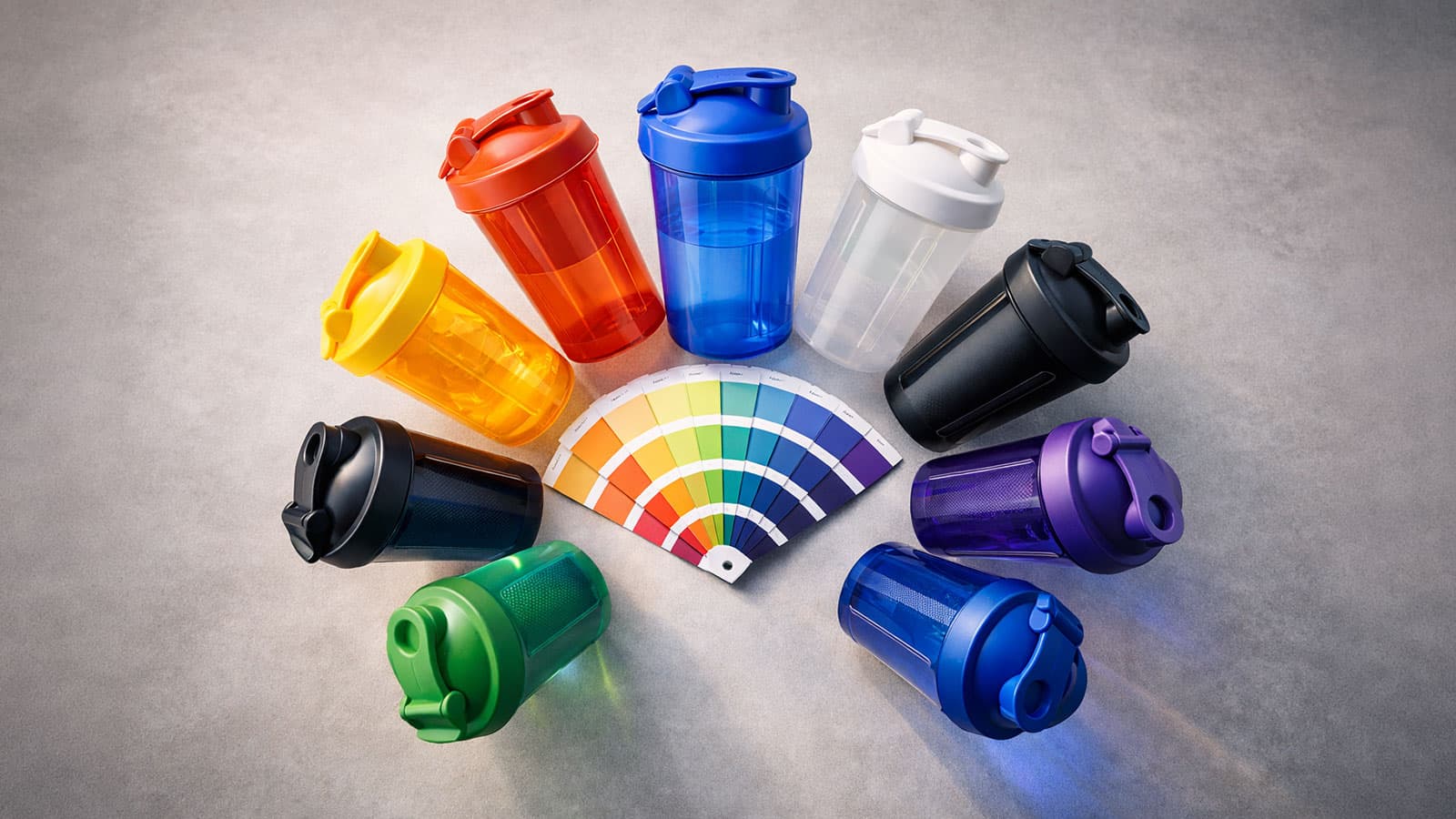
The following table summarizes the key colors, their psychological impact, and optimal use for shaker branding.
| Color | Emotions | Ideal Use | Effect on Shakers |
|---|---|---|---|
| Red | Passion, energy, urgency | Sports brands, nutrition, offers | Stands out at the gym, signals dynamism |
| Blue | Trust, stability, competence | Technology, finance, B2B | Ideal for corporate gifts, professional settings |
| Green | Nature, health, freshness | Organic products, sustainability | Perfect for supplement brands and wellness |
| Black | Luxury, exclusivity, elegance | Premium brands, fashion, high-end | Looks premium and timeless |
| Orange | Enthusiasm, creativity, warmth | Startups, creative industry | Eye-catching and inviting, ideal for events |
| White | Purity, simplicity, modernity | Health, technology, luxury | Clean look, makes the logo stand out |
Practical tip: The safest choice for a first project is black or white as shaker color — both offer maximum contrast for any logo color and suit practically any branding.
Color Combinations for Maximum Impact
The combination of shaker color and print color is crucial. Here are the most effective combinations:
| Combination | Shaker + Print | Effect |
|---|---|---|
| High contrast | Black + White | Premium, elegant |
| High contrast | White + Colored | Clean, logo-focused |
| High contrast | Dark + Neon/Bright | Sporty, eye-catching |
| Tone-on-tone | Dark blue + Light blue | Professional, understated |
| Tone-on-tone | Gray + Silver | Modern, minimalist |
Find details about available color and print options in our product overview.
Practical Guide: The Right Color for Your Industry
| Industry | Recommended Colors | Why |
|---|---|---|
| Fitness and Sports | Red, orange, black, neon green | Energetic colors underline dynamism and motivation |
| Health and Wellness | Green, light blue, white | Natural colors convey health and trust |
| Corporate and B2B | Dark blue, gray, black | Serious and professional for corporate gifts |
| Startups and Tech | Orange, turquoise, purple | Creative colors signal innovation |
| Sustainability and Organic | Green, brown, beige | Earth tones communicate naturalness |
As described in our white-label guide, the product should reflect brand values.
Common Color Selection Mistakes
| Mistake | Problem | Solution |
|---|---|---|
| Favorite color over strategy | Personal taste ≠ brand strategy | Let target audience and positioning decide |
| Too many colors | Cluttered appearance | Maximum 2–3 colors on a shaker |
| Ignoring contrast | Logo barely readable | Always ensure strong contrast |
| Blindly following standards | No differentiation | Deliberate deviation can be an advantage |
| Ignoring printing method | Color doesn't work | Check printing methods comparison first |
Conclusion: Color Is Strategy
The color choice for your branded shaker is not an aesthetic afterthought – it is a strategic marketing decision. The right color strengthens your brand, increases visibility, and subconsciously influences your target audience's perception.
Want to find the perfect shade for your shaker? We advise you on color selection and show you in the configurator how your logo looks on different shaker colors. Get a consultation now – free and without obligation.