Printing a Logo on a Shaker: 8 Tips for a Perfect Print Result
Printing a Logo on a Shaker: 8 Tips for a Perfect Print Result
You have your logo, you've chosen the right shaker — and now it's time to get the print just right. But this is exactly where many projects fall short: a logo that looks perfect on screen can look completely different on a physical product.
In this guide, we share eight tried-and-tested tips to ensure your logo looks just as good on the shaker as it does on your screen.
Tip 1: Always Use Vector Files
Submit your logo as a vector graphic: AI, EPS, SVG, or PDF with embedded vector data.
Vector graphics are built from mathematical paths and can be scaled to any size without losing sharpness. A shaker logo is typically printed at 60 x 40 mm to 120 x 80 mm — pixel-based files often become blurry at these sizes.
Rule of thumb: Use pixel files only as a last resort, and only if they are at least 300 dpi at the final print size.
Good to know: Most logo issues in print are caused by incorrect file formats. If your graphic designer originally created the logo as a vector, ask for the original file — not an export as JPG or PNG.
Tip 2: Respect the Colour Limits of Each Printing Method
Not every printing method can reproduce an unlimited number of colours. Before finalising your logo, you should know what colour options your chosen method offers. In our comparison of printing methods, we have explained the differences in detail.
| Method | Number of Colours | Special Feature |
|---|---|---|
| Screen printing | 1–4 colours | Each colour requires its own screen |
| Pad printing | 1–4 colours | High precision on curved surfaces |
| UV direct printing | Unlimited (CMYK) | Gradients and photos possible |
Design your logo so that a reduced colour version exists that you can use flexibly.
Tip 3: Specify Pantone Colours Instead of RGB or HEX
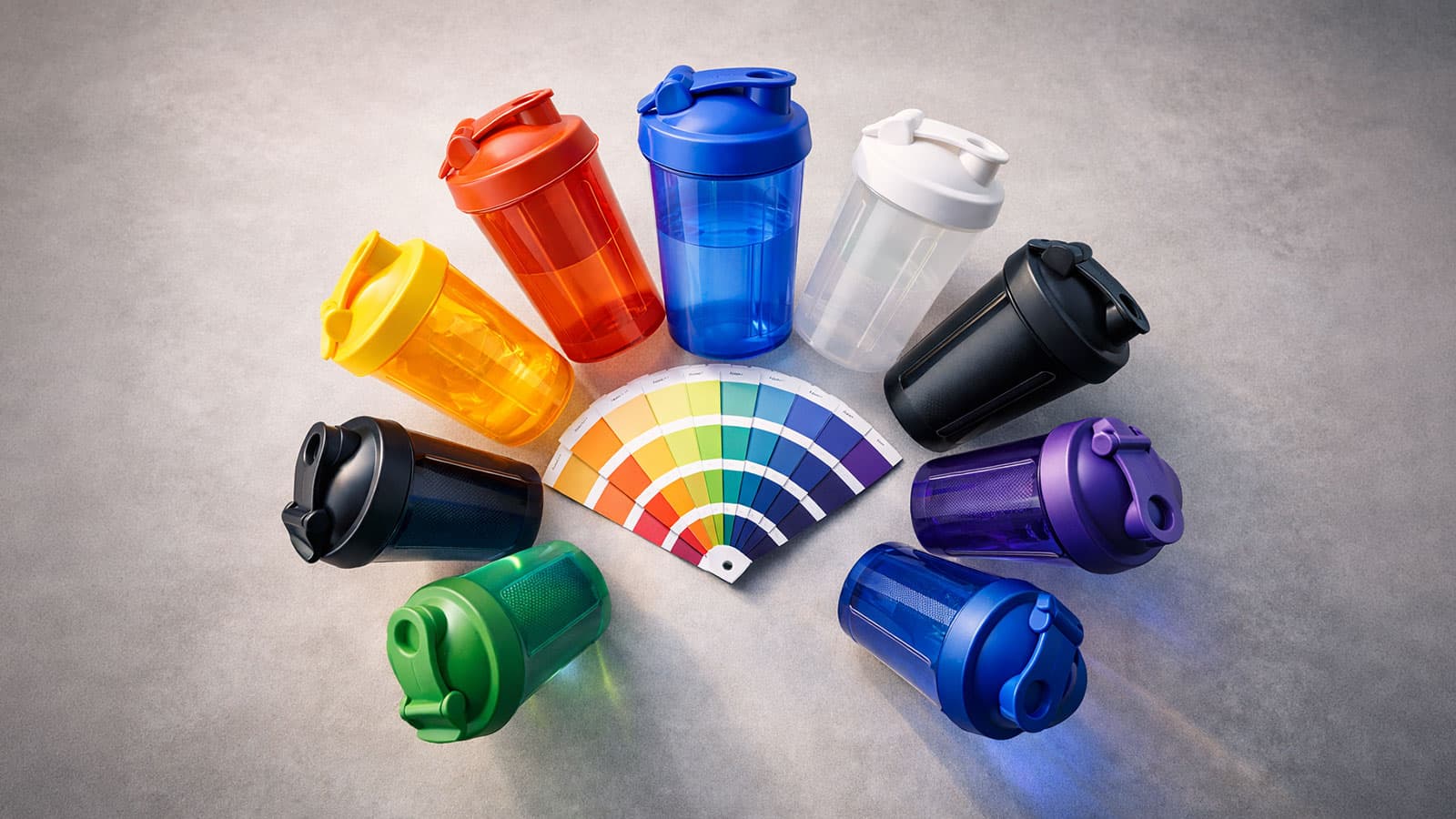
Colour consistency is crucial for a professional brand image. Specify your colours as Pantone values (PMS) — Pantone is a globally established colour system and the best basis for a binding colour match; on plastic, slight deviations remain possible. If you don't have Pantone codes, provide at least CMYK values. RGB and HEX are screen colours and lead to unwanted deviations in physical print.
Practical tip: Ask your graphic designer for the Pantone colour fan. The most common brand colours can be matched in just a few minutes.
Tip 4: Observe Minimum Sizes and Line Weights
Fine details look razor-sharp on screen — but on plastic they can blur or disappear entirely. For this reason, clear minimum sizes apply to physical printing that you should always observe.
| Element | Minimum | Note |
|---|---|---|
| Font size | 6 pt | Smaller text becomes illegible |
| Line weight (positive) | 0.5 mm | Thinner lines will break up |
| Line weight (negative) | 0.8 mm | Reversed-out lines must be wider |
| Clear space around logo | 3 mm | Distance to the edge of the print area |
Delicate elements such as thin serifs or fine patterns are often lost when printing on plastic.
Tip 5: Account for the Curvature of the Surface
A shaker is not a flat sheet of paper — the curved surface distorts the printed image. What appears as a rectangle on screen becomes a slightly curved strip on the shaker. Keep these physical characteristics in mind when positioning your design.
| Factor | Reference Value | Recommendation |
|---|---|---|
| Max. print width | Approx. 120 mm circumference | Don't make the design too wide |
| Horizontal text | Max. 8–10 characters per line | Split longer words across lines |
| Placement | Centred in the middle | Keep the main motif away from the edges |
Tip: Always ask for an unrolled mock-up. At VYTE LABEL, simply request this preview before production — that way you can see how your logo will look on the curved surface.
Tip 6: Prepare Logo Variants for Different Backgrounds
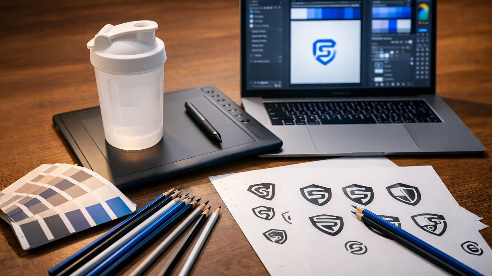
A single logo version is rarely enough. Depending on the shaker colour and printing method, you will need different versions to achieve maximum impact. Investing in multiple logo variants pays off in the long run.
| Variant | Application | When Needed |
|---|---|---|
| Full-colour version | Light/white shakers | Standard case |
| Inverted version | Dark/black shakers | Light colours for contrast |
| Single-colour version | Cost-effective printing | Screen printing with 1 colour |
For advice on planning your branding strategically, read How to Find the Perfect Shaker for Your Brand.
Tip 7: Avoid Common Mistakes
In our day-to-day work, we repeatedly see the same mistakes when logos are submitted for print. The table below shows the most common problems and how to avoid them.
| Mistake | Problem | Solution |
|---|---|---|
| Logo copied from the internet | 72 dpi — far too low | Request the original file from your designer |
| Fonts not converted to outlines | Replaced by a different font on another system | In Illustrator: Type > Create Outlines |
| Transparencies in non-vector files | Unpredictable print results | Specify a white background |
| Too much detail in a small area | Becomes an illegible blob | Simplify the logo for the print size |
| No print data approval | Errors only visible after production | Always approve a digital proof |
Tip 8: Coordinate with the Manufacturer Early
The best time to discuss printability is before the final logo design is completed — not after. An experienced manufacturer will tell you which printing method is optimal, whether certain colours are technically feasible, where the best print position on the shaker is, and what adjustments are needed for a perfect result.
At VYTE LABEL, you can talk through your print data with us in advance — just get in touch before you order.
Practical tip: Send your logo file to the manufacturer early in the process — ideally before you finalise the design. This way, technical limitations can be taken into account in good time.
Summary: Your Logo Checklist
Before you approve your print files, go through every point on the checklist below. A single overlooked item can compromise the entire print result.
| Criterion | Requirement | Note |
|---|---|---|
| File format | Vector (AI, EPS, SVG, PDF) | No JPG/PNG |
| Colours | Pantone or CMYK | No RGB/HEX |
| Resolution | Min. 300 dpi (if pixel-based) | At final print size |
| Fonts | Converted to outlines | No editable fonts |
| Minimum sizes | Text min. 6 pt, lines min. 0.5 mm | Critical on plastic |
| Variants | For light and dark backgrounds | At least 2 versions |
| Simplification | No overly fine details | Test at 40 mm print size |
| Clear space | 3 mm margin to print area | Safety distance |
Conclusion
A perfect logo print on a shaker doesn't start in production — it starts with file preparation. Those who supply the right formats, specify colours correctly, and account for the physical characteristics of the curved surface will achieve a result that looks professional and represents their brand in the best possible light.
Want to have your logo printed on a shaker? Explore our products or contact us directly — we're happy to help.